As painters we are usually faced with the need to simplify. What is left out can be just as important as what is included. Busy areas in a scene can be abstracted to give the viewer a feel for what is there without literally spelling it out. Objects that detract from the story are best deleted. And sometimes a painting is improved by adding things that weren't there at all.
I will show 3 examples of reference photos and what I painted from them to make these points.
This first one was a commission. The client liked the color of the house but wanted more color and plantings in the yard. I agreed that although the house was cute, the empty mowed lawn was not that interesting.
I added bougainvillea on the left and some additional plants in the right foreground. I made the lawn less manicured, suggesting a degree of weediness. I liked the palm shadow on the house but thought It would look better to include a little of the actual tree. I increased the saturation of the house color. I left out the electrical element under the roofline because I thought it was was confusing and unnecessary. Some might delete the flag, but I thought it added a homey touch. This was not the client's house. She wanted a colorful painting that looked southern and beachy and this was something I had in my reference file.
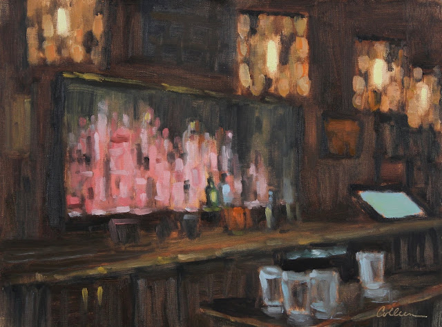
Next is a bar scene that interested me. I loved the huge display in the liquor cabinet under pink light as well as the light fixtures. It was a challenge to paint the bottles without rendering each bottle and label.
I left out an enormous amount of detail but tried to suggest a busy feel. I painted this slowly, creeping up on what finally made it into the painting. I only added one computer screen and kept it simple. I omitted the TV screen above, which was not part of my story. I added the glasses in the foreground for perspective.
This next one will always be a favorite. I have had this photo for many years. Recently I decided I had to do it. My painting companions thought I was nuts, but there was a definite story to tell here. I think what had kept me from trying for so long was that so much of the photo was in black shadow. Painting it like that would have resulted in a very flat scene and would not have revealed what the chickens were looking at- other chickens, of course!
I lightened the shadows and played up the light coming from the other side of the coup. I added chicken/rooster shapes in the middle ground. I made all the light areas warmer than they appeared in the photo. A lot of cad. yellow light and cad. orange was involved.
When planning a painting, ask yourself the following-
1. What is the story or center of interest?
2. Which elements are a distraction?
3. What needs to be simplified or just suggested?
4. What kind of stuff can you make up that will improve the painting? This is the fun part.
Thanks for reading. Be safe!


No comments:
Post a Comment