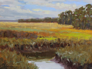
This is a 12"x10" plein air painting from 2016. It was a very special day for me because it was my birthday and I got to paint on a beautiful farm with a dear friend. This was early fall near Leipers Fork, TN. I was very happy with this painting. It was certainly the best I could do at the time. I painted it as it was except to simplify some of the underbrush and push the distant trees by cooling the color I was seeing. As each year passed and the painting never sold, the foreground started to bother me more and more. There was a line of rocks just to the left of the foreground trees making a perfect arc to the corner of the painting. Though this was not a landscaped area, the rocks had a contrived unnatural arrangement. It seemed to pull my eye out of the painting and I knew I didn't like it. I added some random rocks and covered up the line that was heading for the corner of the panel. While at it I brightened the lower sky and water reflections.
This 11"x14" painting is from my reference photo taken on a golf course. It was the sky that interested me and as usual I didn't want it to look like a golf course. The trees on the hill were really there but I added some. Later I saw that the brilliant light lower in the sky was not as impressive as it was in the actual scene. I also thought the foreground was too dark and the trees on the right side were monotonous. Mostly leaving the sky alone, I added some stronger warm brights behind the trees. I eliminated some of the spaces to make the trees look more grouped and I lightened the foliage.
I studied this image of a painting by Daubighny for inspiration, particularly the value and brushwork in the foreground.
This is a recent 9"x12" plein air painting I completed in about 1 1/2 hours. This is a view close to home that I love, but the distant trees are a boring straight line. I always move them around to create more interest. In this case I made up a stand of trees on the right side to help define the middle ground. I soon realized that something was off with those trees, almost as if they were about to slide out of the painting. The word wonky kept popping into my head. In the revised piece you can see that I made the trees that were closer taller and the farther ones shorter, which was the main problem. These pines grow to a similar height. Those that are closer should appear taller. If they had really been there I would have seen that.
In this 12"x9" studio piece the sky was the star of the show, most specifically the sun itself. But the river below with the sunset reflections echoed the drama and I wanted to play that up. I didn't want the foreground to be a dark rectangle so I added some water shapes like we often see at higher tides in the marshes. After letting it "rest" for a while I looked at it with fresh eyes and realized that there were too many straight lines in the lower part of the painting. The one that separated the river from the marsh was unnecessary and seemed to stop the eye from going forward, almost like a fence. It was easy to break up the line with more water and add more of the colorful reflections. I left the sky as it was.
I hope you have enjoyed these studio edits. I recommend having a designated place in the studio for works that might need revision. If you participate in group critiques pull something from this area so you can get input from your artist friends.
Thanks for reading!


