I constantly disappoint myself by trying to exactly match a color in a plein air scene or photograph. Nature is mostly made up of grays, but grays are the perfect stage for a "wow"color. This is easier to achieve by adding or including a man made object, but the natural things can be punched up with discretion. Below is a reference photo and two versions that make the water more exciting.

Our ponds and ocean on the SC coast are a bit drab. Not that I don't love them, but sometimes I get a little bored with the colors. I was drawn to this scene because of the blue water and reflections as well as the strong foreground shadows.
The first painting is a small gouache study on watercolor paper that I painted in a workshop. I was encouraged to keep the color of the water bold. Rather than using ultramarine blue grayed down with a little cad orange, my "go to" mix, I used turquoise blue with some added yellow for the lighter areas.

Below is a larger oil painting, keeping the same thing in mind. I eliminated the numerous verticals but I think I prefer the first composition.

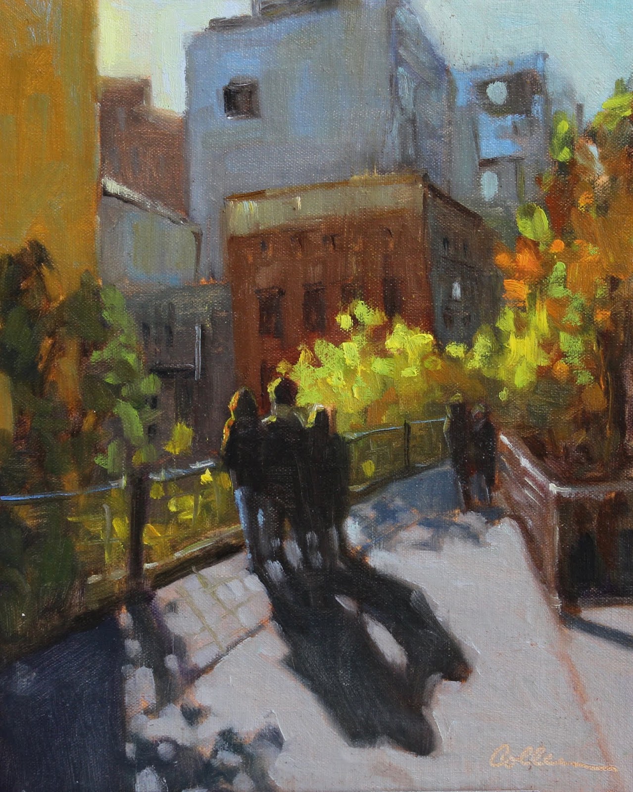
I love the High Line in NYC, always walk it when we are there for a visit. This was an early morning fall shot. I was particularly attracted to the foliage and the backlit figures. In this case the man made objects (architecture and sidewalk) were drab.

So I left them that way and made the leaves brighter than they even were and put colorful highlights on the back lit figures. One of my artist friends suggested that I remove the wall to the left. I considered this but decided I liked the shadows it creates. Also, if you have not taken this walk, the views from the walkway are like a series of tableauxes that appear after passing each building and I wanted to keep that feeling.
Last is one of my favorite places on the planet, Stocking Island which is in the Exumas. Mostly undeveloped, it has a wild surf with both the characteristic turquoise color of the Bahamas and the deeper blues of the Atlantic. You can see below that the color is pretty strong.

I tried an 8"x16" format to eliminate the beach in the foreground. I especially liked this composition because there are 3 basic shapes that are unequal in size- land, water and sky. I made the water even more turquoise, which is how it looks to me in real life. I didn't want to change the cloud formations but added more violet in the lower sky. I'll sometimes add a distant sail, but this one was really there though difficult to see in the photo.

It is fun and informative to push color. If you don't like it you can always tone it down. This makes me think of conflicting advice I have received in workshops. Some instructors maintain that you should start with a more saturated color because it is easier to gray it. Some say just the opposite, that it is easier to punch up a gray. Personally I do not find one easier than the other. I always say do what works for you.
Thanks again for reading! And here's hoping for a better new year!