Saturday, August 31, 2024

Thoughts on My 31 Day Challenge


It has been a long time since my last post, about 3 years. I have missed it but at some point I found that I had said all I had to say for the time being. Since then we have come out of a pandemic and the world has changed. I have continued to paint but have not been as prolific as I used to be. This has partly been because in 2022 my husband and I moved from the South Carolina coast to Asheville, NC. I lost my shows and my painting buddies there, and in spite of the fact that this part of the country is extremely inspiring, I have suffered from the loss of my painting support group. I hadn't realized how important that was to me. Art can be a solitary pursuit and many artists prefer to create alone, but turns out that is not me. I love being with others who enjoy the same activity, especially outside. 

Having been a self described "workshop junkie", this has also diminished. In the last 16 years I have taken well over 50 workshops, the majority of which have been great. After a point I realized that I had mostly heard it all, and it was up to me to dig in and put all of that good instruction into practice. This year I took one workshop and will probably do that from here on out. I don't want to exclude the possibility of learning something new, and I love the camaraderie of a good class and a chance to get to know an artist that I admire. However there is no reason for me to go crazy anymore.

In July I attended a workshop in Maine with my good friend Capey. It was insanely hot, a disappointment, but the instructor was great (Ann Larsen). She suggested, after a brief quick small demo the last day, that if each of us did this daily for a month we would be better painters. It was not the first time I had heard this advice and I tucked it away as I always do. On the way home, Capey informed me that we would in fact be doing this in August. A good month because neither of us had any travel plans or other pressing commitments. I had no choice but to reluctantly agree.

So we did it. I made the awful decision to post my daily paintings on Insta and FB to make sure that should I not succeed I would face public humiliation. My 12 followers would have been forgiving I'm quite sure, but for me it upped the game. 

Here is what I experienced, and assuming you wouldn't be reading this if you weren't a painter, I will proceed to share. 

Making the commitment is obviously the key, and planning it at a time when it is feasible. Pairing off with a friend, putting it on social media, and/or participating in an organized event creates incentive. I remember a few years ago when Strada sponsored one and the winner got a free easel. Capey and I enjoyed discussing our daily efforts, and this was amazingly supportive, as if we had been painting together.

Thinking of something to paint every day for a month was more difficult for me than actually painting. I planned each day's painting a day ahead so I didn't have that hurdle the day of. 

This was a chance to review all of my neglected reference photos, the ones I always thought I would paint but hadn't after many years. I really enjoyed this part. I painted some really ridiculous things and didn't worry about it one bit. I allowed myself to get way out of my comfort zone. I also took this opportunity to experiment with gouache, not my usual medium, and this helped me get more comfortable with it.

I mostly painted on pieces of oil primed linen for the oils or good paper for gouache. The cost of this was low so nothing was too precious, yet I could enjoy the process. I could always mount any favorites and put them in  frames, but maybe I won't. I could always go back to revise some of them, but maybe I won't. 

Now that I have finished this project I wonder if I am a better painter. I'm not sure that is the case. After all, it was only one month. What I do know is that after a long dry-ish spell I am happy to go into my studio again. It is a more welcoming and familiar place. That alone will make me a better painter in the long run.

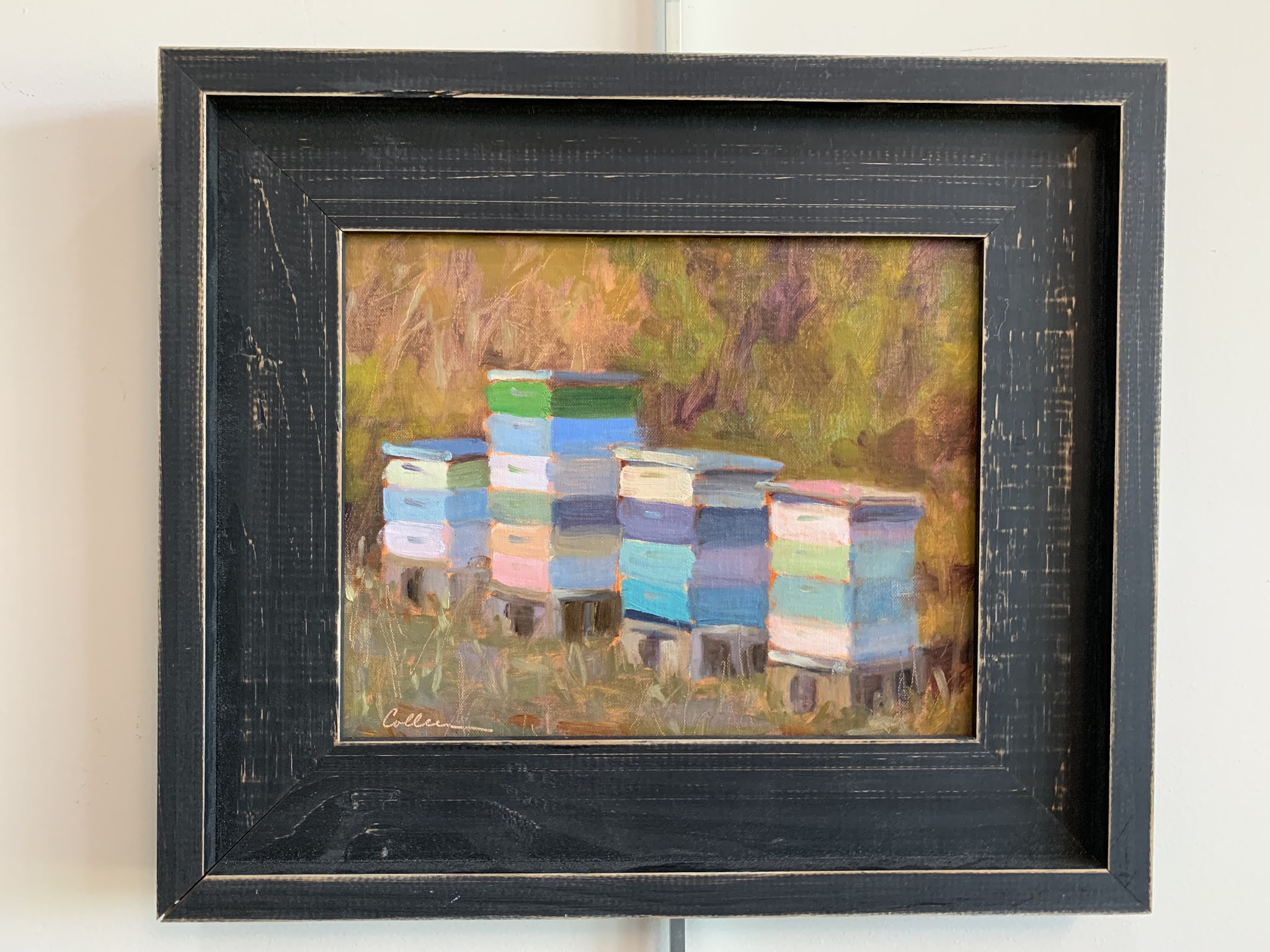
Thanks for reading. I am posting a few from the 31 paintings. They are all on Instagram (cpainter100) or my business Facebook page (Colleen Parker Fine Art) if you would like to see the rest them. It was fun, try it!


                                My best attempt at gouache. A chair in our bedroom.


Like nothing I have ever done, but I always loved my photo of this ghost crab on the SC coast. 


                      This lava lamp is in the Natural History Museum in the                                                        Smithsonian Institute, one of my favorite places. 


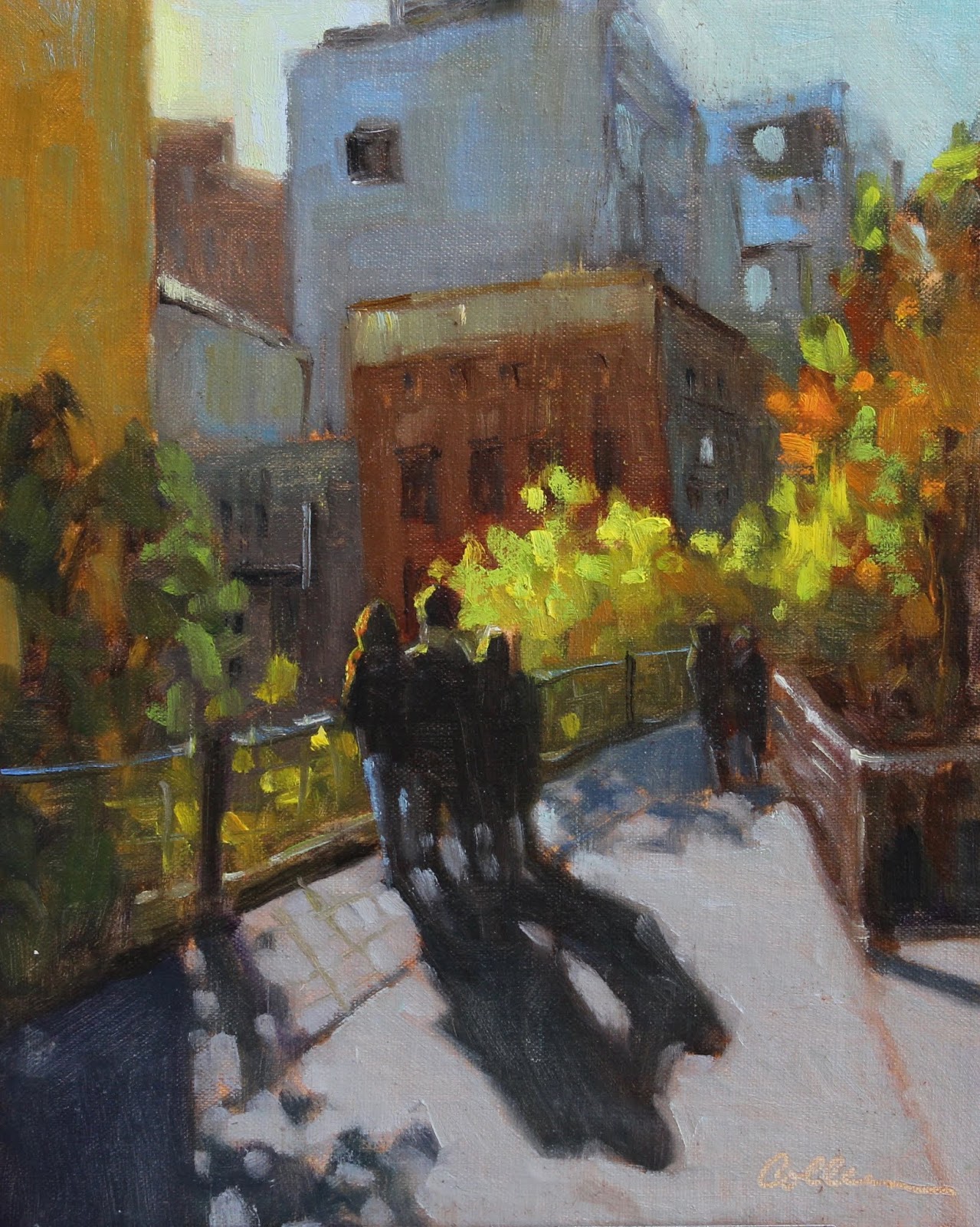
                    Then there were some that were just my usual plain air outings,

                                                           my comfort zone.


Thank you for reading as always. And happy painting!

Colleen


Friday, February 26, 2021

Another Blog Lite- Because We Need to Laugh


I thought I would start 2021 (though I'm a bit late!) with some funny images I have collected over the past couple of years.  I posted a Blog Lite a few years ago and you can take a look if you did not see it.  Blog Lite  As usual, I have not always recorded the source but I will provide it when I can.

Because I am a plein air painter, I so admire those who defy the elements beyond reason, or paint on a scale not even conceivable for the great outdoors.  


                     Steven Quartly in the surf.  My tripod could not handle this!                                       

                                                          
                              Ryan Jensen getting his feet wet and tackling a huge canvas!


                                   This is a 48"x48" oil by Kyle Buckland

Don't know where I got this but I love it.


Many of us have painted pet portraits.  Here are some of my favorite shots of dogs with their portraits.

                                                                    
                                                           He seems pleased.                                                                       

Seriously impressed with himself.  Painting by Gary Millard

Embarrassed?  Painting by Laurie Meyer

The ears are spot on!                   

             For some reason there is no shortage of cave man art comics.                         


                  Last- when Strada decides to compete with Apple.  I'm almost certain this isn't real.


Thanks for indulging me.  I hope that as this new year progresses we can find some bright spots and time to laugh.   Stay well and safe!


Tuesday, December 8, 2020

Pushing Color


I constantly disappoint myself by trying to exactly match a color in a plein air scene or photograph.  Nature is mostly made up of grays, but grays are the perfect stage for a "wow"color.  This is easier to achieve by adding or including a man made object, but the natural things can be punched up with discretion.  Below is a reference photo and two versions that make the water more exciting.


Our ponds and ocean on the SC coast are a bit drab.  Not that I don't love them, but sometimes I get a little bored with the colors.  I was drawn to this scene because of the blue water and reflections as well as the strong foreground shadows.  

The first painting is a small gouache study on watercolor paper that I painted in a workshop.  I was encouraged to keep the color of the water bold.  Rather than using ultramarine blue grayed down with a little cad orange, my "go to" mix, I used turquoise blue with some added yellow for the lighter areas.


Below is a larger oil painting, keeping the same thing in mind.  I eliminated the numerous verticals but I think I prefer the first composition.


I love the High Line in NYC, always walk it when we are there for a visit.  This was an early morning fall shot.  I was particularly attracted to the foliage and the backlit figures. In this case the man made objects (architecture and sidewalk) were drab.


So I left them that way and made the leaves brighter than they even were and put colorful highlights on the back lit figures.  One of my artist friends suggested that I remove the wall to the left.  I considered this but decided I liked the shadows it creates.  Also, if you have not taken this walk, the views from the walkway are like a series of tableauxes that appear after passing each building and I wanted to keep that feeling.


Last is one of my favorite places on the planet, Stocking Island which is in the Exumas. Mostly undeveloped, it has a wild surf with both the characteristic turquoise color of the Bahamas and the deeper blues of the Atlantic.  You can see below that the color is pretty strong.


I tried an 8"x16" format to eliminate the beach in the foreground.  I especially liked this composition because there are 3 basic shapes that are unequal in size- land, water and sky.  I made the water even more turquoise, which is how it looks to me in real life.  I didn't want to change the cloud formations but added more violet in the lower sky.  I'll sometimes add a distant sail, but this one was really there though difficult to see in the photo.


It is fun and informative to push color.  If you don't like it you can always tone it down. This makes me think of conflicting advice I have received in workshops.  Some instructors maintain that you should start with a more saturated color because it is easier to gray it. Some say just the opposite, that it is easier to punch up a gray.  Personally I do not find one easier than the other.  I always say do what works for you.

Thanks again for reading!  And here's hoping for a better new year!

Sunday, October 4, 2020

My New Plein Air Setup

In 2016 I wrote a post about my plein air setup- easel, backpack and all the accessories.
What's in the Backpack

I used this setup for 5 years and it served me very well.  I cannot say enough about my love of the Strada easel, and though I have made changes I will always keep it for travel because it is virtually indestructible.  I never worried about putting it in my checked luggage.  I wouldn't discourage anyone from buying one, and  since I bought mine the design has improved.

But... there are always new products and new temptations.  Recently I became acquainted with the Edge Pro Paintbook.  If you want to stay safe, do not watch the video on the website.  It will be impossible to resist.  Remember that I warned you.  Edge Pro Paintbook

Here is what I like about it compared to my previous easel.  For about an extra pound, the mixing surface is much larger than the Strada mini, which is what I have.  The Strada side trays add extra mixing surface but also add weight, making it closer to the Paintbox. Also they are not included in the price of the easel.  Downside is the Paintbox is made of wood, and though very well constructed I doubt it is unbreakable.  The mixing surface is a very durable glass.  The Strada comes with plexiglass and I didn't replace it, again because of weight, but cleaning glass is so much easier.  I had a number of bad episodes when I let paint dry on the plexiglass.  I mix on glass in my studio so it feels right.  I bought the magnetized mineral spirits can.  It holds onto the light weight side trays (which are included in the price) very well.  I didn't get the tripod in order to spend less. I stuck with my old mefoto because it is so compact and light.  That could be a mistake because it is not as strong, but so far so good. It is rated to hold about 8 lbs., and my loaded easel is significantly less than that.  Mefoto Tripod

My backpack had seen better days, though the appearance wasn't important to me.  It had a number of compartments.  In order for everything to fit I had to pack it the same way each time.  If I was missing anything it was pretty obvious because its spot would be empty.  However, packing and unpacking it was a bit of a nuisance.  A painting friend (thank you Capey!) tipped me off about this one that she saw at a workshop with Marc Hanson and Dottie Leatherwood who use them -  C- Series large backpack 

The inside is one large compartment.  In order to accommodate the Edge Pro I bought the larger size.  It easily holds everything I carry and my tripod fits in the generous pocket and straps on the outside, something my old backpack didn't have.  That leaves more room inside.  There is a velcro pocket inside on the back for smaller items such as viewfinders. The company guarantees them for life.  Custom colors are available but not returnable. This backpack is much more comfortable than my old one.  I think I could actually hike a good distance with my set up now. When fully packed it weighs about 15 lbs.  

I use the same accessories as before- a brush wallet, the collapsable mesh trash holder, a ValueComp card and small viewfinder, all made by Artwork Essentials.   Accessories  Scroll down to find these and other useful items.  I always have small adjustable locking pliers for paint tubes that don't want to share.  They are about $1 at Lowes.  I carry a plastic container for my paint, all small tubes, limited palette for less weight.  Here are all the accessories that fit inside the pack with the paintbox and side trays, plus a towel and my apron.  The small square viewfinder is home made.


I still use the Raymar wet panel carriers and have several sizes, but I also love PanelPaks.  If using a small size I can put it in the backpack for hands free hiking. This clever design allows me to carry one or two wet panels that are the same size. 


Last but not least-  a good sun protective hat is essential.  I have a large head- a family trait- and "one size" hats never work for me.  Tilley makes excellent sized sun protective hats but they are quite expensive.  I have found another site that is more reasonable and has great products.  The hats are sized and they have styles for men and women.  There is a "women with large heads" section!

So here is how it looks in the field-  check out that mixing surface!  And that turp can isn't going anywhere.  I use a cord with binder clips tied to each end to hold the paper towels. Bungie cord hooks don't work well on this easel


And here is the total package-  I keep it, as always, in my studio by the door- a completely separate setup (so I never have to remember to add items from the studio).  Always at the ready- grab and go!  This is a must if you want to paint out regularly.  


I hope you found this update helpful.  Happy painting this fall!

P.S.-
Don't forget the bug spray and sunscreen in the other outside pocket.  


Wednesday, September 23, 2020

Things about Frames

I treat my art as a business, so I keep records of my expenses and sales.  Frames represent about 50% of my yearly expenses.  This has been consistent for at least the last 4 or 5 years.  That was when I decided that my work deserved more than just a cheap frame.  I do not make the frames but I do install my panels and canvases myself which eliminates some of the expense.  I have found a number of good websites that carry quality frames that cost much less than those from custom frame shops.  I have my favorites from each company.

My "go to" company is Florida Frames.  This is a small business.  A human always answers the phone- no phone tree.  It is actually easier to order over the phone than via the website.  They will send free samples if you aren't sure what you want.  If you find a frame you love from a specific company that isn't in the catalog, they will order it if they do business with that company.  Their prices are very reasonable.  Shipping from Florida to South Carolina is not expensive and is fast.  They also give volume discounts (if you buy 3 that are the same frame and size).  This is not a wholesale business but their prices are just as good.  My most used frame is #1100, made by Juhl Larson.  Here it is-


The lip is a warmish silver, kind of like pewter and it goes with just about everything.

I like several frames on Pictureframes.com  They carry a rustic plein air frame, perfect for beach/rural scenes.  I use it in black-


I also like their slim light weight floater frame for larger pieces.  The silver version is very nice, not too shiny, and I have also used the gold.  Very economical for large pieces and they add very little weight.   Each comes in 2 depths so it is important to measure the depth of your stretched canvas.


This is a 30x40 canvas.  The frame adds almost nothing to the size but gives it a nice finished look.  Click on for a larger view.  This is especially good for large paintings that need to go in tight spaces.

I also love ArtFrames  They have elegant plein air frames of every description and with a variety of finishes.  They are pricier than the other sties I use so I usually buy them for special paintings, mainly those by other artists that I have collected.  Here is a painting by Barbara Jaenicke in one of their frames that was in an American Impressionist Society exhibition-


If you are on the West Coast and plein air frames are your favorite, Kingofframes has beautiful options.  They have recently gone to flat rate shipping on small frames making it more economical than it used to be for Easterners.  I especially like this one-  "Arroyo"


I carry my paintings to shows and exhibit areas on a regular basis, so naturally little accidents happen.  I have found a wonderful product for touching up minor defects.  This is another way to stretch your framing dollars.   Rub 'n Buff comes in a variety of colors including 3 different golds.  Amazon carries these products at a reasonable price and offers some color sets.


I used to pick a frame for each finished painting, and once framed I never changed it. Now I rotate frames almost as often as I grocery shop, which is less than it used to be but still... Doing this is good for frame economy.  That is to say that at any given time I have paintings in frames that I have on display in my studio or plan to exhibit elsewhere, and unframed paintings that can be rotated back into a frame on an as needed basis.  That is why settling on a set number of favorite frames that usually work with my painting style and subject matter allows for maximum flexibility.  If a painting sells online and I don't have a frame for it I will buy a new one, but I always offer the option of buying a painting unframed for a discount.  Collectors sometimes want to pick their own frames. 

If you did not read this previously, here is a related post about framing tips-     

Of course your can eliminate frame expenses entirely by using gallery wrapped canvases or cradled panels.  This is a nice contemporary look and some collectors prefer it.  I think that my paintings look better framed (and I really hate painting edges!) but many paintings look fine without one.

I hope this has been helpful!


Sunday, August 23, 2020

Quick Fixes

I have posted some fixer uppers before but please indulge me.  I love looking at paintings that have been sitting around for months or years to see what I can do to make them better.  You can click on any of these images for a larger view.


This is a 12"x10" plein air painting from 2016.  It was a very special day for me because it was my birthday and I got to paint on a beautiful farm with a dear friend.  This was early fall near Leipers Fork, TN.  I was very happy with this painting.  It was certainly the best I could do at the time.  I painted it as it was except to simplify some of the underbrush and push the distant trees by cooling the color I was seeing.  As each year passed and the painting never sold, the foreground started to bother me more and more.  There was a line of rocks just to the left of the foreground trees making a perfect arc to the corner of the painting.  Though this was not a landscaped area, the rocks had a contrived unnatural arrangement.  It seemed to pull my eye out of the painting and I knew I didn't like it.  I added some random rocks and covered up the line that was heading for the corner of the panel.  While at it I brightened the lower sky and water reflections.  


This 11"x14" painting is from my reference photo taken on a golf course.  It was the sky that interested me and as usual I didn't want it to look like a golf course.  The trees on the hill were really there but I added some.  Later I saw that the brilliant light lower in the sky was not as impressive as it was in the actual scene.  I also thought the foreground was too dark and the trees on the right side were monotonous.  Mostly leaving the sky alone, I added some stronger warm brights behind the trees.  I eliminated some of the spaces to make the trees look more grouped and I lightened the foliage.    


I studied this image of a painting by Daubighny for inspiration, particularly the value and brushwork in the foreground.


This is a recent 9"x12" plein air painting I completed in about 1 1/2 hours.  This is a view close to home that I love,  but the distant trees are a boring straight line.  I always move them around to create more interest.  In this case I made up a stand of trees on the right side to help define the middle ground.  I soon realized that something was off with those trees, almost as if they were about to slide out of the painting.  The word wonky kept popping into my head.   In the revised piece you can see that I made the trees that were closer taller and the farther ones shorter, which was the main problem.  These pines grow to a similar height.  Those that are closer should appear taller.  If they had really been there I would have seen that.  


In this 12"x9" studio piece the sky was the star of the show, most specifically the sun itself. But the river below with the sunset reflections echoed the drama and I wanted to play that up.  I didn't want the foreground to be a dark rectangle so I added some water shapes like we often see at higher tides in the marshes.  After letting it "rest" for a while I looked at it with fresh eyes and realized that there were too many straight lines in the lower part of the painting.  The one that separated the river from the marsh was unnecessary and seemed to stop the eye from going forward, almost like a fence.  It was easy to break up the line with more water and add more of the colorful reflections.  I left the sky as it was.


I hope you have enjoyed these studio edits.  I recommend having a designated place in the studio for works that might need revision.  If you participate in group critiques pull something from this area so you can get input from your artist friends.

Thanks for reading!

Friday, July 17, 2020

Painting from a Plein Air Study

I have talked about plein air paintings many times.  They can serve as finished pieces to frame and sell if they are successful, and they are often my favorites because of their freshness and simplicity.  Mine are always small, but I have seen very large pieces painted on location.  Some artists make several visits to the site on days with similar conditions in order to paint a large canvas.  I envy those who can paint fast enough to get something larger finished in one session.

However many paint on location in order to gather basic information, such as color notes, with no intention of coming up with a finished painting.  When I say color notes I mean putting down the value/hue/temperature of the main elements of the painting, perhaps leaving out any kind of detail whatsoever.  A reference photo provides details where necessary.

I always aim for a somewhat finished piece when possible, but sometimes I use an outdoor work only as a guide for a larger painting.  Here is an example of an attempt at this.

Recently I painted with a group of friends on a golf course by a river.  It was a bright morning and the sparkle on the water drew me to the scene.  As I have said before, I do not like to paint golf courses.  Here is my reference-


It was a good day for clouds.  I had to zoom in quite a bit to see this distant layering of land and water.  I didn't want to include the golf course in the foreground.  The entire scene was vast, but I thought I could make something of the shapes in this limited area.

It took a little over an hour to paint this 6"x8" study-


I put the darker values in first, trying to exaggerate the shapes.  Though not in my reference, I borrowed some nearby land shapes for the foreground.  The water was moving quickly in bright sunlight so there were no reflections.  I pushed the distant trees farther back and warmed up the sky and clouds.  The plein air piece looks a lot more like the actual scene than the photo.

While working in the studio I never looked at the reference photo.  Using the study, I painted this 12"x16" painting-


I decided to raise the horizon to make room for a more dominant foreground.  I played around with the land/grasses shapes to make a lead in through the sparkly water toward the distant water and trees.  I darkened the water in the foreground to give it more depth. The painting wound up being more about the water than the sky.  After all, that is what spoke to me that morning.

Painting a bright scene like this on location  is best done quickly, thus my tiny canvas. My eyes get very tired after a short time.  I break the rule about sunglasses because my eyes are more important to me than my painting.  I do remove them periodically during the process to see what I am actually getting down so I can make adjustments.  I will save the little study in case I decide to try this again, maybe with a different composition, perhaps mostly sky.

Speaking of bright scenes, here is a reference I took that was just to the left of the scene I painted.  I knew my eyes couldn't take it so I will try it from the photo, hopefully soon before my memory fades.  Having done the other paintings will be helpful.


Thanks for reading!

P.S-  I did it after writing this post.  11"x14", "Rain and Shine" because of the drama I added in the background.